How to Choose the Right Colors for Your Branding Photoshoot
Choosing the Right Colors For Your Branding Photoshoot Isn’t Hard
Color is everywhere in our world and informs many of our choices without our even being aware that it does.
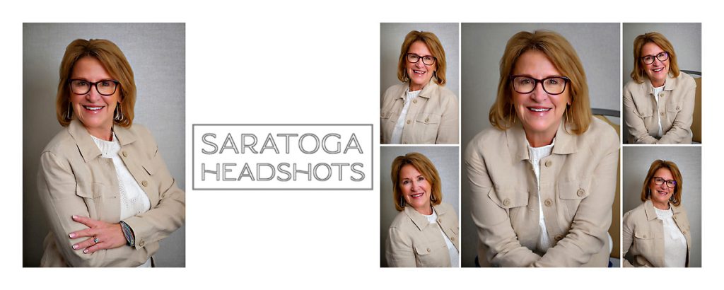
I am a big fan of Karen’s outfit choice because while it is neutral, it has texture and visual interest. She looks friendly, engaging and comfortable.
Your personal brand is way more than just a logo or a perfectly curated Instagram feed. It’s the feeling people get when they interact with you online. One of the most powerful and subtle ways to communicate that feeling in your personal branding photos is through the judicious use of color.
The colors you choose to wear and incorporate into your branding photoshoot can immediately shape how your target audience perceives you. Whether you want to appear approachable, luxurious, creative, confident, or calm, your color choices help tell that story before you ever say a word.
As a professional branding photographer, one of the most common questions I hear is: “What colors should I wear for my branding session?” Here are some things to consider when choosing colors to align with your brand, flatter you in front of the camera, and create images you will love using across your website and social media platforms.

Your Brand Identity is a good place to start when thinking about colors for your portraits.
Always Start With Your Brand Identity
Before choosing outfits, very carefully think about the message you want your brand to communicate. Think about how you would want potential clients to perceive both you and your brand.
You don’t necessarily need to overthink it, but do ask yourself some questions:
- What feeling do I want people to have when they see me or my brand?
- What key words best describe my business or creative process?
- What emotions do I want my photos to bring out when people see them?
Different colors naturally communicate different moods and vibes. Harness the power of color to reinforce your brand.
Color Psychology in Branding
-

Color has a huge subliminal impact when viewers look at portraits. This is a photo for an author who writes detective mysteries. We went dark.
- White → clean, modern, minimal
- Black → sophisticated, powerful, luxury
- Beige & Neutrals → warm, approachable, timeless
- Pink → feminine, playful, creative
- Green → growth, wellness, natural
- Red → bold, energetic, confident
- Yellow → optimistic, cheerful, energetic
- Blue → trustworthy, calm, professional
A wellness coach may gravitate toward earthy greens and soft neutrals because they want to seem nuturing. A luxury realtor might choose crisp black, white, and camel tones to imply sophistication and luxury to appeal to a high end clientele. A creative entrepreneur may want to use brighter colors that feel expressive, artistic, and energetic.
The key is choosing colors that reflect your brand identity authentically while at the same time flattering you.
Work With Your Existing Brand Colors
If you have already spent money on branding graphics and identity, you should lean into that. The colors in your branding photos should feel cohesive and tie into the rest of your online presence. They should complement and not clash with whatever branding you already have going on.
Take a look at the following:
- Your website
- Logo
- Instagram feed
- Marketing collateral
If your brand already uses a specific color palette, consider incorporating those tones subtly into your wardrobe, accessories, props, or locations. This creates a subtle visual experience across all platforms.
For example:
- If your website is full of soft neutrals and warm tones, neon colors may feel disconnected or even strange, distracting from your message.
- If your brand is vibrant, modern, or high end, rich colors or bold accents can work beautifully.
Remember: Consistency builds recognition and trust. This naturally extends to your choice of color in your branding graphics and photos.
Complement Your Skin Tone With Colors
The best branding photos happen when you feel confident. Believe it or not, wearing flattering colors makes a huge difference.
Warm Undertones
You may look best in:
- Cream
- Olive
- Camel
- Rust
- Warm reds
- Mustard
Cool Undertones
You may shine in:
- Bright white
- Navy
- Emerald
- Lavender
- Cool blues
- Jewel tones
Neutral Undertones
You can often wear both warm and cool shades beautifully.
If you’re unsure, hold different colored fabrics near your face in natural light and notice which shades make your skin look brighter and healthier.
Stick to Solid Colors Over Busy Patterns
While patterns can occasionally work well, solid colors tend to photograph best for portraits and personal branding sessions.
Why?
- They keep the focus on you
- They create cleaner, more versatile images
- They age better over time
- They are easier to mix across websites, graphics, and social media
If you love patterns, choose subtle ones with minimal contrast and avoid tiny prints that can become distracting on camera. As a Portrait Photographer, I have tended to work to match backgrounds to clothing anyway. We can make it work if we know ahead of time what you are planning.
Neutrals Are Always a Safe Choice
Neutral tones are timeless, elevated, and versatile. They also will tend to work really well with whatever your branding colors are in your logo, website, etc.
Some of the best neutral options for branding photos include:
- White
- Cream
- Beige
- Camel
- Gray
- Taupe
- Soft brown
- Black
These colors photograph beautifully in almost every setting and allow your expressions and personality to remain the focal point.
Neutrals also make it easier to create a cohesive gallery when incorporating multiple outfits during your session.
Consider Colors In Your Photoshoot Location
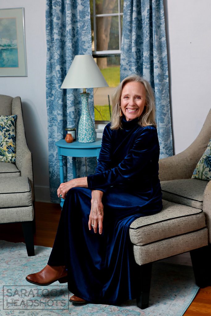
I absolutely love the dark blue velvet dress Maureen chose to wear in this branding photo. It ties in with the location so well.
Your environment and backdrop matters just as much as your wardrobe. That extends to the colors in that environment.
Whether you choose an indoor studio environment or a location such as an office or park, color should be complementary, not distracting. Even when you are on location, the focus of the image should be YOU, not the location.
Avoid Trendy Colors, Prints, And Styles
Trendy colors and clothing can date your images very quickly. Think about how some photos from your past look twenty years later–we all laugh about the goofy clothing from the 1960s, 1970s and 1980s, right? Lots of groovy colors, prints and plaids.
Since branding photos are often used across websites, marketing materials, and social platforms for months (or even years), timeless colors tend to provide the most longevity. Truly, you want to get the most bang for your buck here.
Classic palettes usually create more polished and professional images than ultra-trendy neon or seasonal shades. The exception I would make here is if the session was for an artist or other creative. There is a little more leeway for people in the arts.
Bring Variety But Keep It Simple
For most branding sessions, I recommend choosing:
- One neutral outfit
- One slightly elevated or bold look
- One casual option
This gives you a versatile image gallery with a variety of moods and uses while still maintaining visual continuity. Bonus points for items that can be layered and that work together.
Stick to a cohesive color palette throughout all outfits so your final gallery feels polished and intentional. The outfits do not necessarily be “matchy-matchy,” but they should complement each other subtly.
Wear What Feels Like You
Most of all, wear what feels like you.
The best branding photos happen when you feel comfortable, confident, and authentic.
If a color technically “fits your brand” but doesn’t feel like you, it will feel somehow off. You do not need to wear a color that is a perfect duplicate of your branding colors. Try something in a different shade or something complimentary.
Your personal brand should feel aligned — not forced. It is like Goldilocks. Make it just right.
Choose colors that make you feel the way you want to be perceived. When you feel good, it always translates on camera.
Choosing Your Clothing Shouldn’t Be Stressful

Choosing your outfits for your session should not be stressful!
Choosing the right colors for your personal branding photoshoot can completely transform the way your audience connects with your brand. The right palette creates consistency, elevates your professionalism, and helps communicate your unique personality visually. A little thought and planning ahead will remove most of the stress.
To recap, when planning your session, focus on colors that:
- Align with your brand
- Complement your skin tone
- Work with your location
- Feel timeless and authentic
Your branding photos are an investment in how your business is perceived. A Professional Branding Shoot is one of the most cost effective investments you can make in your business. And thoughtful color choices will make all the difference.
If you’re planning a personal branding session and need help styling your wardrobe, I always guide my clients through outfit and color selection to ensure their images feel cohesive, elevated, and true to their brand. I have found a simple conversation before your session can make a huge difference in the final result.
If you enjoyed this post on choosing the right colors for your Branding Photoshoot, you might also enjoy What Will You Wear For Your Headshots.
Are you ready to book a Headshot or Personal Branding Session? Great! Use our Contact Form to get in touch.