Your Secret to Success | Color Harmony in Headshots & Branding Portraits
Your Secret Weapon for Cohesive Personal Branding and Headshots is Color Harmony
Hey there, all you business rockstars and personal brand builders!
Let’s have a little heart-to-heart about something that is not often talked about—but absolutely should be if you’re serious about showing up polished, professional, and powerful. That would be color harmony in your headshots and branding portraits.
You may have already nailed your niche, fine-tuned your elevator pitch, and possibly even hired a pro photographer. But have you thought about how the colors in your images will be working for (or against) your brand?
If you have ever been to this store, you know the colors and prints are recognizable immediately.
Let’s dive right in.
What Is Color Harmony Anyway (And Why Should You Care)?
In simple terms, color harmony is when the colors in your photo “get along.” There should be no loud arguments between your background, clothing, and skin tone. Preferably there is no jarring contrast that makes your audience squint. You should have a seamless, professional and put together look that quietly states “I’ve got this.” When pulled together correctly, color harmony may not even be immediately apparent—you are so busy enjoying the photos that you aren’t concerned with how everything is working together. On the other hand, bad color combinations just scream at the viewers and can even turn them off.
In the world of branding portraits and headshots, that kind of polish that color harmony brings is everything.
Color harmony helps:
- Highlight your face (important in a headshot or any other portrait honestly)
- Support your brand identity with visual consistency
- Make your photos look timeless and professional, not trendy and dated
- Create emotional alignment—viewers feel the vibe you’re going for before they read a single word
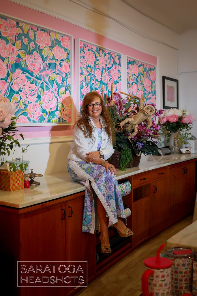
Mary is an intuitive and a writer. She has a soft and gentle personality. I actually painted the pink backdrop to match her logo.
Let’s Get Real: Why It Matters for Headshots & Branding Portraits
Headshots aren’t just for LinkedIn anymore. They’re front and center on websites, email signatures, media kits, speaker bios, Zoom profiles—you name it. And branding portraits? They’re your visual handshake with the world.
So think about this: how do you want to be remembered?
If your brand is bold and high-energy, your color choices can reflect that with vibrant, punchy tones.
If your brand is calm, grounded, and nurturing, think soft neutrals, gentle earth tones, or cool pastels.
The colors you wear and surround yourself with can and should tell a story—make sure it’s the right one.

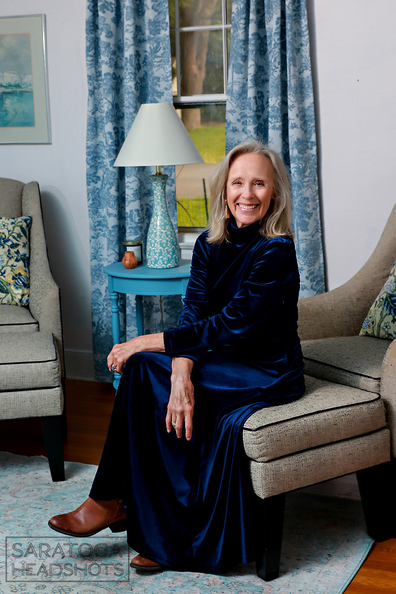
Love this image of Joe. This is actually in his dining room at the time. The wall color and the colors in the Track painting were perfect with what he was wearing.
5 Easy Ways to Nail Color Harmony in Branding Portraits
Let’s make it simple and take the mystery out of it. Here’s how to make sure your headshots and branding portraits can look as aligned to your mission statement:
- Start With Your Brand Colors
If you already have a brand palette, use it! Bring those tones into your clothing, background, or props. It creates instant cohesion across your website and socials.
Pro tip: Don’t wear your logo colors exactly—go for complementary or muted versions so they don’t overpower your face.
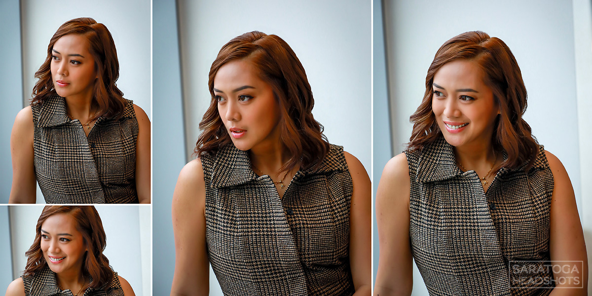
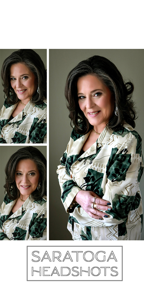
- Dress Intentionaly
Avoid overly busy patterns or colors that compete with your skin tone. Instead, opt for colors that complement your complexion and eyes—warm tones for warm undertones, cool tones for cool undertones. A little color analysis can go a long way!
- Use Backdrops Strategically
A backdrop can make or break your photo. Neutral tones are great for versatility, but a subtle splash of branded color in the background (like a soft blush, sage, or slate) can elevate your image without distracting from the primary subject—you!
- Think About Location
If your shoot is outdoors or in a styled space, be aware of how the natural colors around you will interact with your clothing and skin. A rustic wood wall might be gorgeous—but maybe not if you’re wearing a similar shade and end up looking like a floating head.
- Edit for Consistency
Proper editing goes a really long way. Keeping color tones consistent across your photo set so they look great side-by-side on a homepage, portfolio, or Instagram grid is key. And while trendy editing styles and presets might seem to be the cool new thing, headshots and branding photos are an investment that need to keep paying dividends over time. Therefore, classic, clean, natural, and simple edits are often the best.

I used a navy background with Jennifer’s yellow blazer because those two colors were key in the cover of the book she wrote. Jennifer is also very aware of what colors look great on her and came prepared.
Bonus: Color Harmony Builds Brand Trust
Here’s the kicker—so much is subliminal. When your headshots and branding portraits are visually cohesive, people subconsciously trust you more. You look professional. You look prepared. You look like someone who pays attention to the details (because you do).
It is absolutely about more than just aesthetics—it’s about alignment. And in today’s busy digital-first world, that kind of polish sets you apart.

I knew we would be going outdoors in downtown Glens Falls. So we kept Bill’s attire pretty simple and classic because the backgrounds would be busy.
Finally: Color Harmony Is the Ultimate Power Move

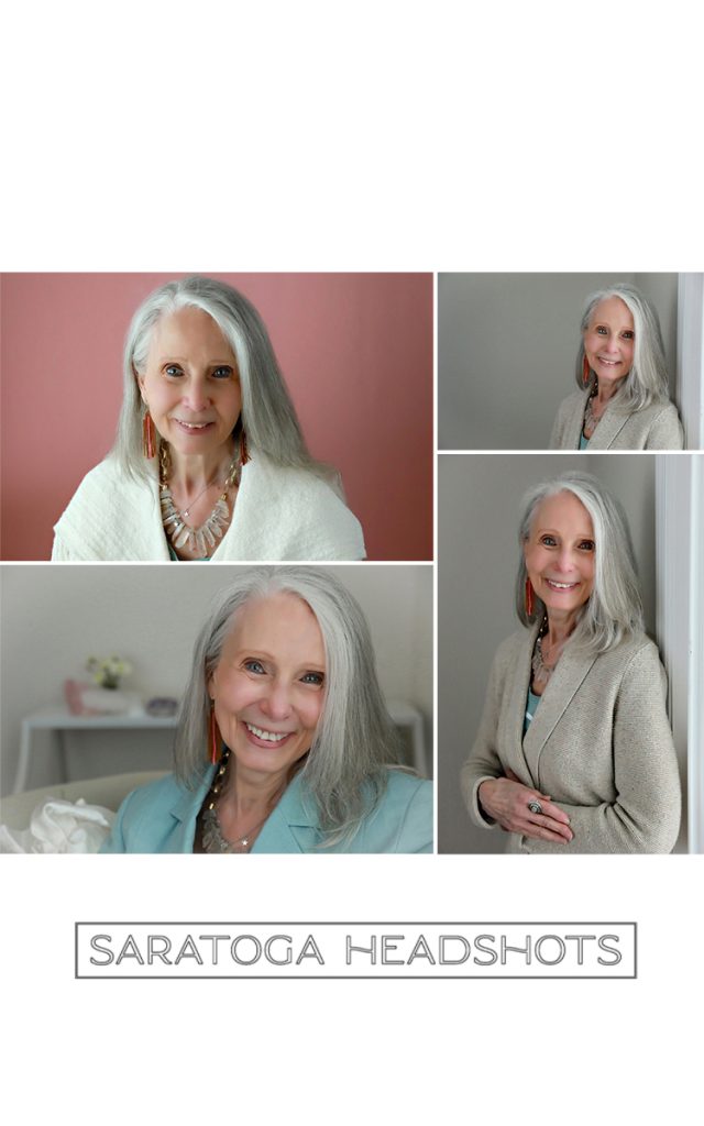
Neutrals are always a great bet for wardrobe.
Color harmony might seem like an extra “nice to have,” but in branding—it’s a power move.
When the colors in your headshots and branding portraits work together, the whole image becomes more than just a nice picture. It becomes a visual story about who you are, what you do, and why people should care. Because perception of color is often subliminal, it will actually stick in people’s minds longer and for the right reasons.
So whether you’re updating your website, planning a rebrand, or just refreshing your social media accounts, take a moment to plan your color palette with intention.
You’ve got the vision—now make sure the visuals match.
Read more: How Color Impacts Your Headshots.
To get in touch, call the Studio directly at (518) 584-4237 or use our Contact Form today.
Saratoga Headshots is proud to serve business and professional clients in the Capital District Area of Upstate NY.